
Redesigning the Healthy Mind Map Mobile App
Redesigning the Healthy Mind Map Mobile App
Skip to Final UI
I was brought on to work alongside the Design Director at Cooper Carlo on a complete redesign of the Healthy Mind Map app. The project began with establishing the visual foundation before expanding into onboarding and other core areas of the experience.
The redesign remains an ongoing effort, with current work focused on introducing new features and continuing to evolve the product as development progresses.
Timeline
11/25-Current
Role
Lead UX/UI Designer

Healthy Mind Map?
Healthy Mind Map?
Healthy Mind Map is a mental wellness platform that helps users better understand, track, and improve their mental health through assessments, activities, insights, and personalized resources.
Healthy Mind Map is a mental wellness platform that helps users better understand, track, and improve their mental health through assessments, activities, insights, and personalized resources.
My Role
My Role
Working alongside the Director of Design at Cooper Carlo, I support the UX, UI, and interaction design of the platform across onboarding, visual design, and new feature development.
Working alongside the Director of Design at Cooper Carlo, I support the UX, UI, and interaction design of the platform across onboarding, visual design, and new feature development.
The Starting Point
The Starting Point
The app had expanded over time, but without a unified experience or meaningful encouragement.
The app had expanded over time, but without a unified experience or meaningful encouragement.
Limited User Engagement
Unlike newer wellness apps, the experience offered little feedback or encouragement as users moved through their mental health journey.
Falling Behind the Category
Many competing apps offered clearer navigation, stronger visual consistency, and more engaging experiences.

Laying the Foundation
Laying the Foundation
Before redesigning individual screens, we established a shared visual foundation for the product. Creating a consistent color palette and reusable styles ensured every new feature would feel connected as the redesign expanded.
Before redesigning individual screens, we established a shared visual foundation for the product. Creating a consistent color palette and reusable styles ensured every new feature would feel connected as the redesign expanded.
The refreshed palette replaced dated gradients with a simpler, more modern system centered around purple. It created a calmer visual identity while providing a foundation for the UI kit and component library shown next.
The refreshed palette replaced dated gradients with a simpler, more modern system centered around purple. It created a calmer visual identity while providing a foundation for the UI kit and component library shown next.

Figma Component UI Kit
Figma Component UI Kit
With the new visual styles in place, I created a UI kit in Figma to bring consistency to the product. Core components like buttons, inputs, cards, and navigation were redesigned as reusable building blocks.
With the new visual styles in place, I created a UI kit in Figma to bring consistency to the product. Core components like buttons, inputs, cards, and navigation were redesigned as reusable building blocks.
The kit also gave developers a clear starting point for the MVP and made it easier to expand the product without introducing new inconsistencies.
The kit also gave developers a clear starting point for the MVP and made it easier to expand the product without introducing new inconsistencies.

Together, these updates created a shared foundation that kept the experience consistent across designers while giving developers a clear starting point for the MVP.
Together, these updates created a shared foundation that kept the experience consistent across designers while giving developers a clear starting point for the MVP.
The Old Onboarding Experience
Redesigning the Onboarding Experience
With the new visual styles in place, onboarding was the next step. The existing experience didn't do enough to explain the app or help users get started.
Feature Focused Instead of User Focused
The onboarding introduced features one by one but did little to explain how they would support users.
Information Overload
The app made it possible to record information, but offered little feedback or encouragement to keep users engaged over time.
Redesigning the HMM Onboarding Experience
Redesigning the HMM Onboarding Experience
With the new visual style in place, the next step was onboarding.
With the new visual style in place, the next step was onboarding.
Feature-Focused Instead of User-Focused
Feature-Focused Instead of
User-Focused
The onboarding introduced features one by one but did little to explain how they would support users or improve their mental wellness over time.
The onboarding introduced features one by one but did little to explain how they would support users or improve their mental wellness over time.
Too Much Before Getting Started
Too Much Before Getting Started
The app made it possible to record information, but offered little feedback, progress, or encouragement to keep users engaged over time.
The app made it possible to record information, but offered little feedback, progress, or encouragement to keep users engaged over time.
Bringing the Journey to Life
Bringing the Journey to Life
The redesign introduced a road trip themed gamification system that transforms Healthy Mind Map into a visual journey. Onboarding became the starting point for the experience users continue building over time.
The redesign would introduce a van and road trip themed gamification system.
After choosing a camper van, a user would earn stickers, accessories, and other rewards, turning progress into something users can see and personalize over time.
Personal Connection: Personalizing a camper van gives users a greater sense of ownership from the very beginning.
Unique Experience: A van & journey based system helps Healthy Mind Map stand apart from traditional mental wellness apps.
Visible Progress: Rewards, stickers, and upgrades give users a clear visual representation of their progress.
Natural Metaphor: A road trip naturally reflects mental wellness, where growth happens gradually rather than all at once.
A More Personal Onboarding
A More Personal Onboarding
Users begin by choosing the color of their camper van before creating an account.
Users begin by choosing the color of their camper van before creating an account.
Users begin by choosing the color of their camper van before creating an account.
This small interaction creates a sense of ownership and introduces the journey they'll continue building throughout the app.
This small interaction creates a sense of ownership and introduces the journey they'll continue building throughout the app.
This small interaction creates a sense of ownership and introduces the journey they'll continue building throughout the app.
Interactive Prototype Displayed
View Prototype
My Responsibilities
My Responsibilities
I focused on the UX and UI details. This included interaction states, spacing, layouts, and component behavior throughout the onboarding experience, while my partner focused on the brand identity/style.
I focused on the UX and UI details. This included interaction states, spacing, layouts, and component behavior throughout the onboarding experience, while my partner focused on the brand identity/style.

Choose an activity to begin building healthy habits from day one.
Choose an activity to begin building healthy habits from day one.

Select the topics that best reflect what you'd like to work on first.
Select the topics that best reflect what you'd like to work on first.

Choose a camper van to personalize the journey from the very beginning.
Choose a camper van to personalize the journey from the very beginning.
The Why Behind the Design
The Why Behind the Design
The following examples highlight the thinking behind key design decisions. Each solution was refined through multiple rounds of iteration, user feedback and design reviews.
The following examples highlight the thinking behind key design decisions. Each solution was refined through multiple rounds of iteration, user feedback and design reviews.
Focus Area Selection
Focus Area Selection
The original design relied on bright accent colors, multiple icon styles, and longer descriptions that made the screen feel busier than necessary. For a mental wellness app, the interface felt more playful than calming. There was also a very limited amount of focus areas for a user to chose.
The original design relied on bright accent colors, multiple icon styles, and longer descriptions that made the screen feel busier than necessary. For a mental wellness app, the interface felt more playful than calming. There was also a very limited amount of focus areas for a user to chose.

The redesign introduced a simpler visual style with muted icons, shorter copy, and a refined color palette. Active states rely on subtle icon and border changes, making multi-select feel clean and intuitive.
The redesign introduced a simpler visual style with muted icons, shorter copy, and a refined color palette. Active states rely on subtle icon and border changes, making multi-select feel clean and intuitive.
Starting Activity Selection
Starting Activity Selection
The original screen relied on bright colors, long descriptions, and a traditional list that required more reading before making a choice. The amount of color and detail felt busy for an experience centered around mental wellness.
The original screen relied on bright colors, long descriptions, and a traditional list that required more reading before making a choice. The amount of color and detail felt busy for an experience centered around mental wellness.

A simpler layout, larger visuals, and shorter copy reduce cognitive load while making the first step feel more approachable.
A simpler layout, larger visuals, and shorter copy reduce cognitive load while making the first step feel more approachable.
Expanding the Gamification Experience
Expanding the Gamification Experience
The journey map gives users a visual representation of their mental health journey.
The journey map gives users a visual representation of their mental health journey.
I helped shape the map concept and designed collectible stickers, license plates, customization interactions, and journey events.
I helped shape the map concept and designed collectible stickers, license plates, customization interactions, and journey events.
License Plates/Covers
License Plates/Covers
Car Stickers
Car Stickers
Journey Events
Journey Events

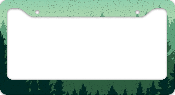
License Plates & Covers
License Plates & Covers
Users can unlock different license plate styles and covers, then customize them to make their van feel more personal.
Users can unlock different license plate styles and covers, then customize them to make their van feel more personal.


Parallel Parking Victim
HMM
Bigfoot saw me
and nobody believed him!

HMM
Brake Check Survivor

Good Tides
HMM


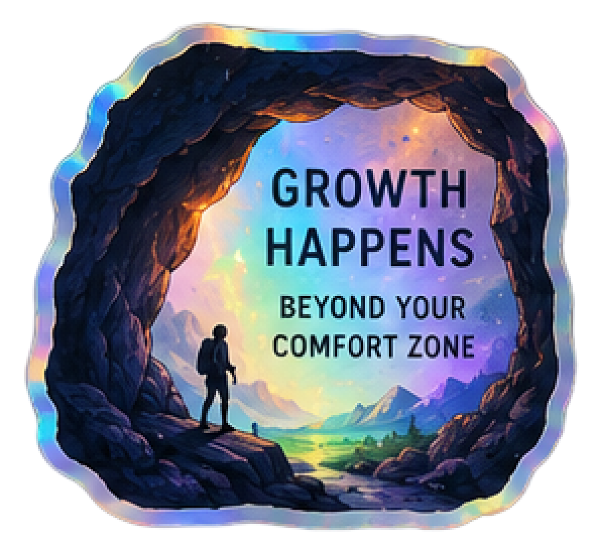
Van Stickers
Van Stickers
Users earn stickers by completing goals, check-ins, and milestones. Rare events add variety, while collected stickers personalize their van and showcase progress.
Users earn stickers by completing goals, check-ins, and milestones. Rare events add variety, while collected stickers personalize their van and showcase progress.







Sticker Packaging
Sticker Packaging
Reusable branded packaging makes earned stickers feel more like real collectibles. Different package styles add variety and recreate the feeling of opening and collecting physical stickers.
Reusable branded packaging makes earned stickers feel more like real collectibles. Different package styles add variety and recreate the feeling of opening and collecting physical stickers.


Your Collection & Progress
Your Collection & Progress
The profile page brings customization and progress into one place, including sticker collections, color options, unlocked items, and a breakdown of the user’s journey. This screen is still being refined as we work through the full UX and UI.
The profile page brings customization and progress into one place, including sticker collections, color options, unlocked items, and a breakdown of the user’s journey. This screen is still being refined as we work through the full UX and UI.

Events Along the Journey
Events Along the Journey
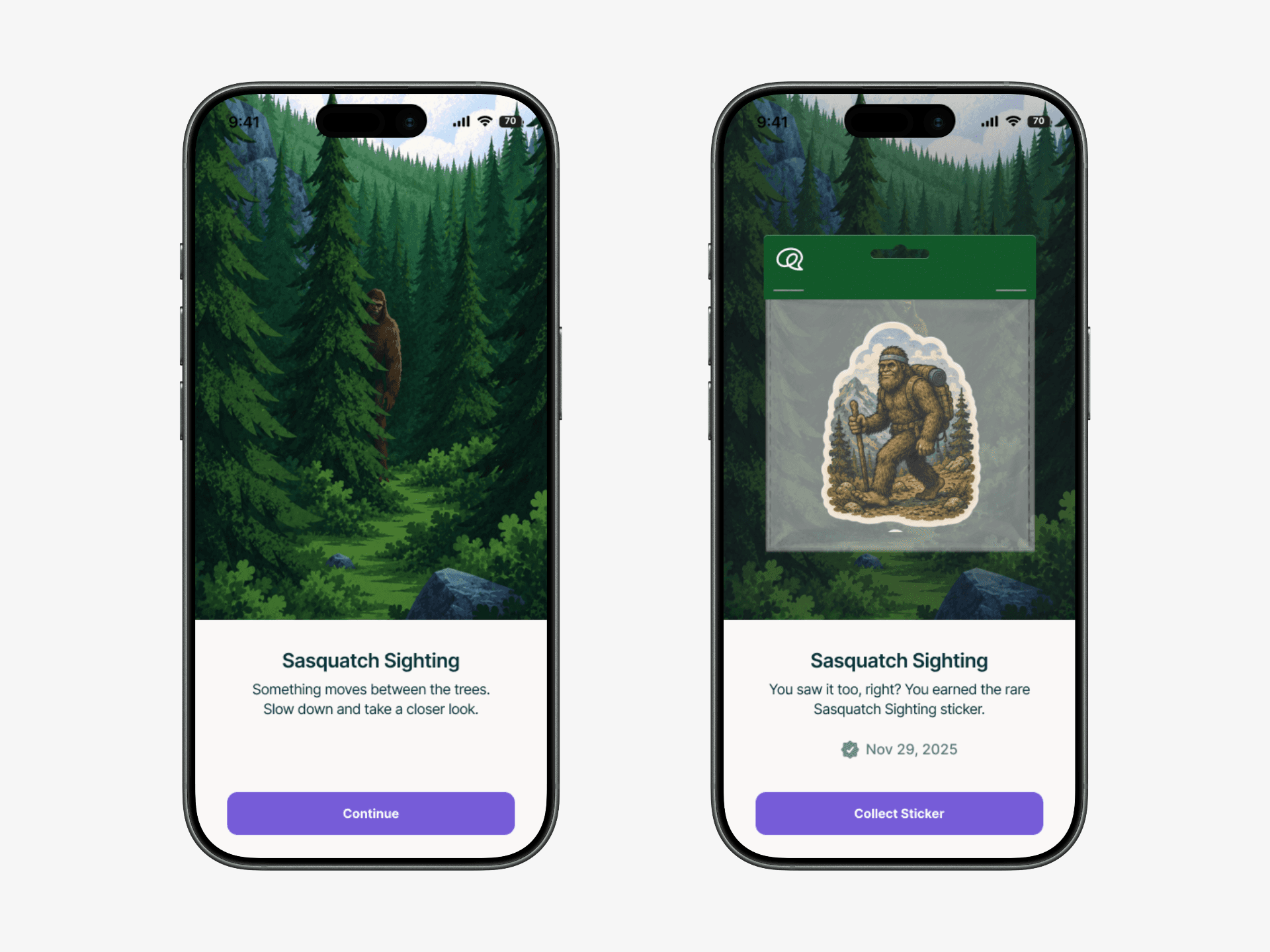
As users progress through their journey, they unlock interactive roadside events inspired by classic road trips. Each event celebrates progress, introduces new experiences, and rewards users with collectible stickers.
As users progress through their journey, they unlock interactive roadside events inspired by classic road trips. Each event celebrates progress, introduces new experiences, and rewards users with collectible stickers.
I designed the event experience, supporting illustrations, and sticker collection system to bring the road trip theme to life.
I designed the event experience, supporting illustrations, and sticker collection system to bring the road trip theme to life.

Roadside Experiences
Roadside Experiences
As users travel through Healthy Mind Map, they discover interactive roadside events that reward progress with unique collectible stickers.
As users travel through Healthy Mind Map, they discover interactive roadside events that reward progress with unique collectible stickers.
Over 10 unique events have been designed, with more planned as the experience continues to grow.
Over 10 unique events have been designed, with more planned as the experience continues to grow.
Interactive Prototype Displayed
Sticker Stands
Reaching certain milestones unlocks a sticker stand, where users can choose a new sticker and place it directly on their van to mark their progress.
Interactive Prototype Displayed
Continuing the Product Roadmap
Continuing the Product Roadmap
The redesign remains an ongoing effort, with several major areas of the product still planned as development continues.
The redesign remains an ongoing effort, with several major areas of the product still planned as development continues.
Complete the journey themed gamification and sticker collection system.
Design the user profile, camper van, and personalization experience.
Expand the activity library and supporting wellness features.
Redesign the analytics and progress tracking experience.
Design the companion web application and dashboard.
Continue refining UX, UI, and interaction patterns across the platform.
Complete the journey themed gamification and sticker collection system.
Design the user profile, camper van, and personalization experience.
Expand the activity library and supporting wellness features.
Redesign the analytics and progress tracking experience.
Design the companion web application and dashboard.
Continue refining UX, UI, and interaction patterns across the platform.
Redesign Progress
Redesign Progress
With the onboarding experience complete and the core gamification system established, the project is well positioned for the upcoming MVP release. Future work will continue expanding personalization, journey events, and rewards throughout the app.
With the onboarding experience complete and the core gamification system established, the project is well positioned for the upcoming MVP release. Future work will continue expanding personalization, journey events, and rewards throughout the app.
Long Term Engagement: Created a more engaging experience by introducing personalization, rewards, and progression throughout the product.
Built to Scale: Established a scalable gamification system that supports future features and content.
Shared Design Language: Designed a cohesive visual language across onboarding, events, stickers, and customization.
Personal Journey: Turned mental wellness into a journey users can personalize and build over time.
The Work So Far
The Work So Far


