Mayo Clinic
SaaS Invoice Redesign
Saving a multimillion-dollar hospital contract with an invoicing platform redesign.
I led a full course correction of Vendor Bridge, simplifying workflows, improving invoicing clarity, and bringing the experience up to the expectations of a large healthcare client.
Timeline
6/25 – 11/25
Role
Lead UX/UI Designer

Overview
What is Vendor Bridge?
VendorBridge was built to manage service contracts and invoicing but after a year of dev led design it was confusing, incomplete, and losing trust. A large client was ready to walk away along with a multimillion dollar contract.
I stepped in to lead a course correction. Partnering with business stakeholders, developers, and end users, I rebuilt workflows, simplified invoicing, and set up a clear design system driven by voice of customer feedback.
The Situation
Mayo Clinic Threatened to Terminate Our Contract
After a failed release, Mayo Clinic set up a 2-day on-site to review the current state of Vendobridge. Two years of development had produced something they couldn't actually use. The workflows were broken, the invoicing was a mess, and after all that time they were frustrated with what we had built.


It was clear from the start the product needed a full redesign. The dashboard was a static table with no guidance, missing features, and fragmented workflows.
Our Goal
Rebuild Vendor Bridge
Complete a full redesign of Vendor Bridge in three months to fix broken workflows, simplify the experience, and make it usable day to day, while meeting the expectations of a major healthcare client and rebuilding confidence in the product.
My Role & Responsibilities
Sole Product Designer/Led the redesign from start to finish
User Interface & Visual Design
QA & Development Support Throughout
User Research & Competitive Analysis
Cross functional collaboration between Product, Stakeholders and Developers
Approach
Our Plan for Rebuilding
When I joined the project, the first priority was to stabilize what already existed. We set a plan to achieve feature parity by fixing the broken and incomplete features, creating a solid base to expand from.

Evaluation & Repair
Our goal was to reach feature parity across the dashboard, invoice details, and contract management. User feedback helped guide how we approached that work, surfacing a few key themes:
What Was Feature Parity & How Can We Fix Current State?
No Clear Action
Users couldn’t tell what to do next, with the interface offering no clear guidance.
Confusing UI
The screens didn’t feel like an invoice or contract and were just very confusing.
Missing Features
There was no way to dispute invoices, creating a major workflow gap.
Internal Heuristic Analysis & Evaluation
Before beginning the redesign, I took time to understand what wasn’t working and why, conducting my own analysis to avoid repeating the same issues
The Dashboard/Landing Page

1
2
4
3
5
6
1
Unclear tab architecture
Tabs didn't reflect user workflows—navigation felt arbitrary and users couldn't predict what they'd find where.
2
No page hierarchy
Dashboard title and CTA appeared without context, leaving users unsure of their location or next steps.
3
Overall Page Design
The interface lacked visual refinement and didn't communicate trustworthiness to enterprise users managing millions in contracts.
4
Role-based inconsistency
The same layout served, reviewer, procurement and supplier roles without addressing each role's actual needs.
5
Status visibility gaps
Contract and invoice status—critical for procurement—blended together without clear distinction, creating compliance risk.
6
Search without structure
Search existed but offered no filtering options, making it impossible to narrow results in a database of thousands of contracts.
Contract Creation & Details

1
2
4
3
5
6
1
Disabled navigation elements
Tabs and fields were disabled without explanation, leaving users unsure whether they could interact with content or why certain options were unavailable.
2
Confusing page instructions
Introduction text and headings were awkwardly written, making it unclear what users should do or what section they were in.
3
Always active input fields
Input boxes appeared in an active state even when disabled, creating visual confusion about what was actually editable.
4
Manual invoice upload burden
To attach an invoice to a contract, users had to download and reupload an Excel sheet, adding unnecessary friction to the workflow.
5
Primary action buttons
Buttons appeared randomly throughout the form with no context, and critical dispute functionality was missing entirely.
6
Dated visual design
Cluttered drop shadows and outdated styling made the interface feel unprofessional and difficult to scan quickly.
Detailed Invoice Screen

1
2
4
3
5
6
1
Inactive tabs with no purpose
Tabs appeared in the navigation that weren't even active or relevant to the current view, adding visual clutter without value.
2
Confusing information architecture
Mixed contract and invoice data in navigation without clear separation, making it difficult for users to understand what they were viewing.
3
Disabled input fields always active
Input boxes appeared in an active state even when disabled, creating confusion about which fields were actually editable.
4
Outdated visual design
Dated styling made the interface feel unprofessional and difficult to scan, undermining user confidence in the system.
5
Buttons without context or dispute
Secondary buttons appeared with no explanation, and critical dispute functionality was entirely missing from the interface.
6
Inputs with no guidance
Input fields appeared without context or instructions, leaving users uncertain about what data belonged where or why fields existed.
User Feedback Loop
Iterative Design Approach
I started the redesign with the invoice details page, using VOC feedback to guide an iterative feedback loop on this screen. While only one feedback cycle is shown here, this process was consistently applied across the redesign.

V1
The Starting Point
Users said the screen didn’t match how they expect invoices to look, making it confusing and hard to read.
V2
Improved, but Still Off
I improved spacing, hierarchy, and structure, but it still didn’t feel like an invoice for non-technical users.


V3
Matched Real-World Expectations
Shifted to a more document-like layout with familiar patterns to better match how users expect an invoice to feel.
Repair & Improvement
Reworking the Original Screens
After aligning on the new direction and getting client approval, the three screens were redesigned to be more clear and easier to use. This set the foundation for how the experience adapts across each role.
The Dashboard/Landing Page
Rather than a generic list view, we built role-specific landing pages that surface high-priority work, key metrics, and actionable insights upfront. The reviewer dashboard is shown below.


Role Based Dashboards
Show only what each role needs.
Remove irrelevant data
Focus on key decisions
Work Queue
Keep critical work front and center.
Surface disputes and approvals
Defer non-urgent tasks
Key Metrics
Turns insight into action.
Highlight priority trends
See workload at a glance
Create Invoice & Invoice Details
Split invoice creation and details into separate screens, replacing Excel uploads with more flexible options like manual entry, email, and OCR uploads. The invoice details view was reorganized to surface key information, clarify status, and added a dispute functionality.


Flexible creation
Multiple ways to create invoices.
Manual entry
Email submission/Upload + OCR HITL
Familiar structure
Matches how invoices actually look.
No Excel dependency
Built for non-technical users
Faster input
Less friction, quicker completion.
Streamlined fields
Clear flow from start to finish

Clear overview
Everything important, in one place.
Key info surfaced upfront
Continued the physical invoice mental model
Action-ready
Next steps are obvious.
Approve, reject, dispute
Status always visible
Better organization
Easier to scan and understand.
Clean hierarchy
Reduced clutter
Create Contract & Contract Details
Split contract creation and details into separate screens, introducing a clearer flow with progress tracking across the contract lifecycle. The details view reuses the invoice layout for consistency, improving usability and making actions like adding invoices quick and straightforward.
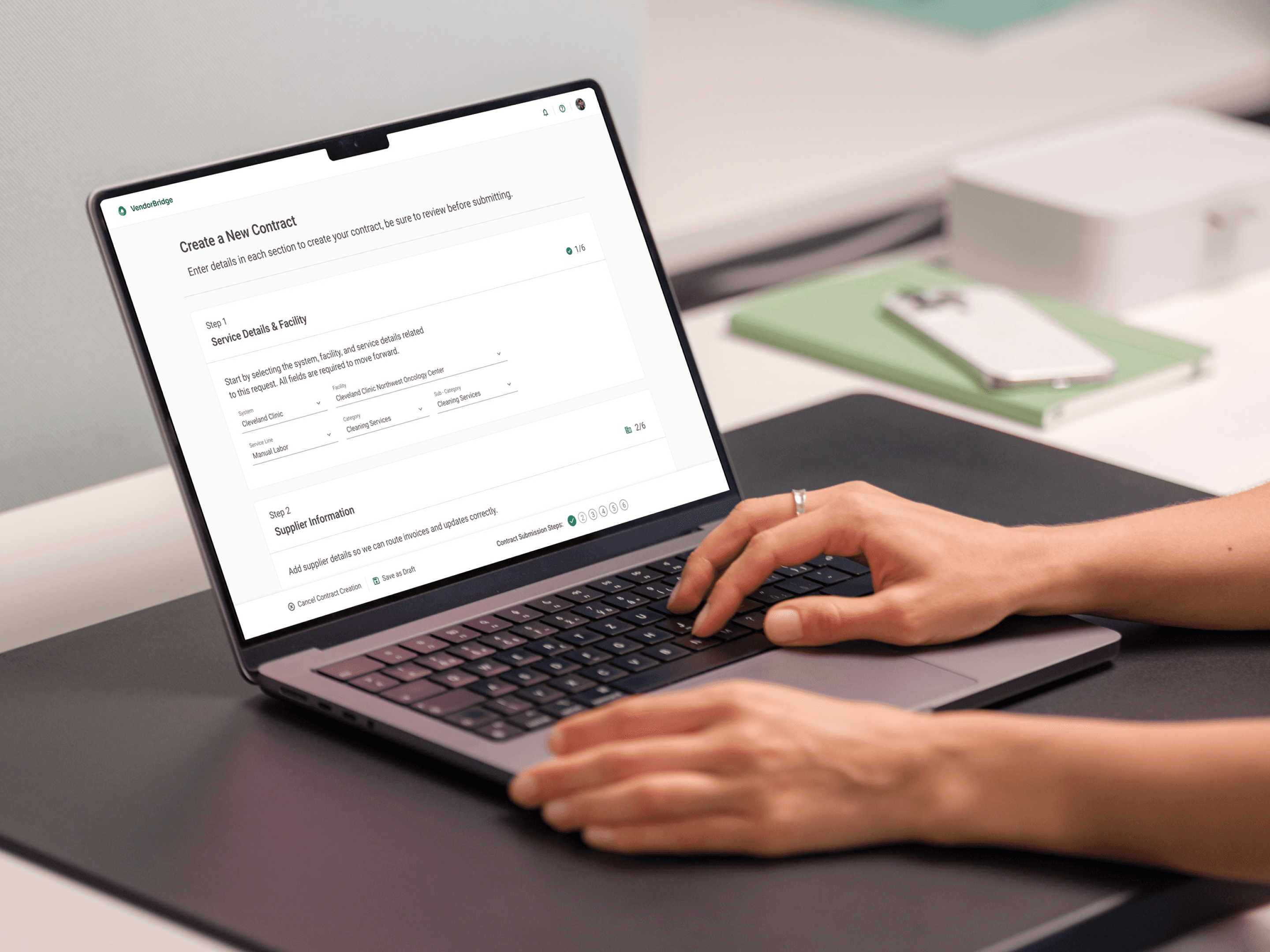
Separate flow
Separate from invoice details
Clear step-by-step process
Reduced confusion upfront
Guided input
Structured to match contracts.
Logical field grouping
Progress tracking through steps
Faster setup
Less friction to create contracts.
Streamlined inputs
Clear path to completion

Consistent layout
Built on the invoice details structure.
Familiar UI patterns
Fasted development
Actionable view
Key actions are easy to take.
Add invoices in one click
Manage contracts more efficiently
Clear structure
Clean design and scannable.
Better organization of key data
Reduced clutter across the page
The New Flow
Switching to a Role-Based Structure
After reviewing user feedback and stakeholder input, we stepped back and rethought the structure. Instead of forcing everything into three screens, we redesigned the product around three custom ux/ui roles: Procurement, Supplier, and Reviewer.

Procurement
Creates and manages service contracts, defining scope, terms, and approval rules.
Initiates the workflow that suppliers invoice against once services are completed.


Supplier
Submits invoices tied directly to approved contracts and completed services.
Responds to disputes by providing documentation, corrections, or resubmissions.

Wrapping Up
The Redesigned Product
Due to the length of the case study, this is a condensed view of the final work. What you’ve seen here reflects my overall approach, how I restructured the product, simplified key flows, and iterated based on regular user feedback. I’m happy to walk through the full set of designs, decisions, and iterations in more detail in a conversation.
The final designs shown below represent the next phase of the redesign as the product continued to evolve.
Two additional role-specific dashboards
Expanded information and features on invoice details
Expanded information and features on contract details
More complete dispute functionality
Additional features currently in progress


The Result? A Platform That Looks, Works, and Feels Completely Different.
Wrapping Up
Feedback & Impact
The redesign received great feedback from the client, team members and Vizient Leadership.
Blake - thank you for jumping in with such enthusiasm and making an immediate impact since joining the team. Your dedication to enhancing the UI and UX has not gone unnoticed. I truly appreciate your thoughtfulness and hard work you bring to improving our users’s experience, and I value your partnership every step of the way.
Waseem H.
Senior Director of Product Delivery
Thank you for being a UX design weapon on the Service Sync project. I want to recognize you for: Raising the bar on Service Sync design, providing high quality design iterations in a timely manner, being a true advocate of the customer by leading VoC sessions and incorporating their feedback into our solutions, leading client facing UX presentations, collaborating with the engineering team to address design feedback, and being a great design partner. Looking forward to our continued collaboration.
Matt C.
AVP Finance Delivery
What Changed and Why it Mattered
VendorBridge went from a confusing, outdated liability to a tool users trust and Mayo Clinic depends on, thanks to a complete redesign and renewed relationships across teams.
Streamlined Core Workflows
Simplified the product with clearer navigation and a more structured interface, making key tasks faster and easier to complete.
Rebuilt Stakeholder Confidence
Worked closely with stakeholders to align on a better direction and regain support for the redesign.
Repaired a Strained Client Partnership
Delivered clearer, higher-quality work and collaborated closely with the client to rebuild trust and move forward.
Let's Talk
Let's Talk
Currently looking for new roles & ready to start within a 2 weeks notice.
Copy component
Copied
blakeschubertux@gmail.com
Copyright © Blake Schubert 2025
Built With Framer, Figma, Cursor & v0