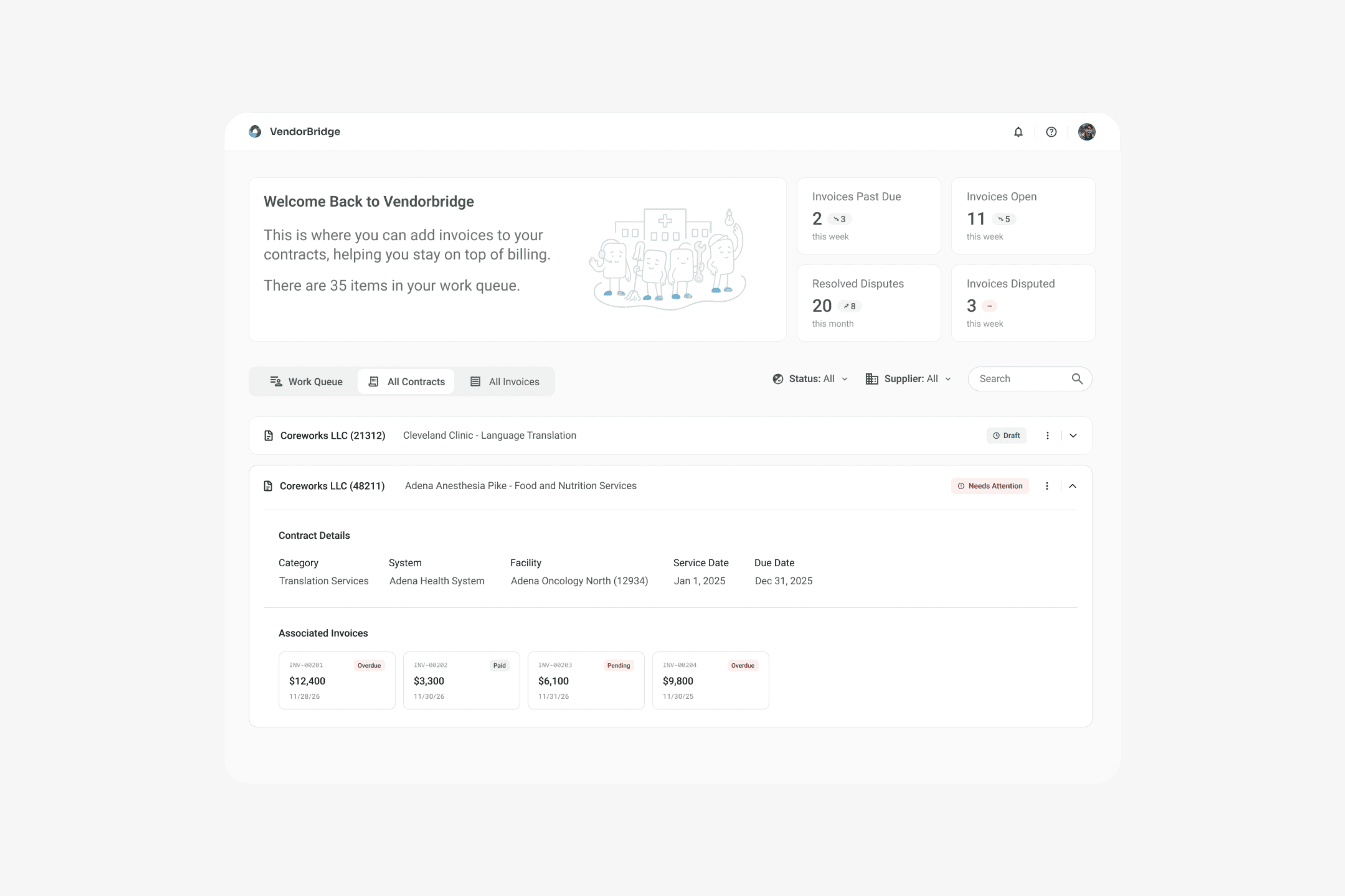
Redesigning an Enterprise Contract & Invoicing Tool

VendorBridge was built to manage service contracts and invoicing but after a year of dev led design it was confusing, incomplete, and losing trust. A large client was ready to walk away along with a multimillion dollar contract.

I stepped in to lead a course correction. Partnering with business stakeholders, developers, and end users, I rebuilt workflows, simplified invoicing, and set up a clear design system driven by voice of customer feedback.

Timeline

10/25

Team

1 Designer, 1 Product Manager, 10 Developers, 2 QA

Vendor Bridge?

VendorBridge was built to manage service contracts and invoicing but after a year of dev led design it was confusing, incomplete, and losing trust. A large client was ready to walk away along with a multimillion dollar contract.

My Role

I stepped in to lead a course correction. Partnering with business stakeholders, developers, and end users, I rebuilt workflows, simplified invoicing, and driven by voice of customer feedback.

The Situation

After a failed release, Mayo Clinic set up a 2-day on-site to review the current state of Vendobridge. Two years of development had produced something they couldn't actually use. The workflows were broken, the invoicing was a mess, and after all that time they were frustrated with what we had built.

It was clear a total redesign was needed, so I stepped in to lead a course correction. I rebuilt VendorBridge from the ground up using customer feedback.

Constraints & Solutions

A tight timeline, an outsourced development team, and a complete product rebuild shaped the project from start to finish. To keep the project moving, I focused on clear communication, reusable design patterns, and close collaboration with developers.

Constraints

An outsourced development team and a tight timeline made collaboration difficult.

We needed to totally redesign the product screen by screen on a tight timeline.

Solutions

I attended all agile ceremonies and held sprint reviews. I was available through all stages of development to answer questions, unblock work, and spoke with developers to learn constraints before designing.

I created reusable page patterns and worked closely with developers early to align designs with technical constraints.

Our Plan For Rebuilding

Before redesigning the core screens, we needed a solid foundation to build from. I worked with product stakeholders to map each role, identify pain points, and make sure we didn't repeat the same mistakes.

Instead of forcing everything into three screens, we redesigned the product around three custom ux/ui roles: Procurement, Supplier, and Reviewer.

Procurement

  • Creates and manages service contracts, defining scope, terms, and approval rules.

  • Initiates the workflow that suppliers invoice against once services are completed.

Supplier

  • Submits invoices tied directly to approved contracts and completed services.

  • Responds to disputes by providing documentation, corrections, or resubmissions.

Reviewer

  • Approve, deny, or dispute invoices sent my suppliers

  • If a dispute is created, resolve the dispute by working with the supplier

Feature Parity

There were three main screens for Vendor Bridge when I first joined. The plan was to start the redesign with these 3 to create feature parity then present to our client for feedback. After the client approved the design we would advance to redesign the rest of the application and new features.

After the client approved the design we would advance to redesign the rest of the application and new features.

Landing Page/Dashboard

Invoice Details/Creation

Contract Details/Creation

What Wasn't Working?

Before I had joined the project our client had a two day onsite feedback session to review current state of the product. One outcome of this onsite was they wanted a new designer, and that is where I came in.

The feedback we received could be summarized into 4 items:

Users couldn’t tell what to do next, with the interface offering no clear guidance. we needed to simplify the experience and provide more context

Many users were not technical and many of the screens didn’t feel like an invoice or contract. They looked overly (datad/technical>)

Many missing features, There was no way to dispute invoices, creating a major workflow gap.

document managemnt a huge issue- only way to upload invoices was to download and reupload excel docs and manual contract creation had bad ux/missing fields

Invoice Details

Confusing information architecture mixed contract and invoice data, making it difficult to understand what users were viewing.

Disabled inputs, unclear buttons, and a lack of guidance left users unsure what they could edit or do next.

Outdated visual design, inactive tabs, and unnecessary elements added clutter without providing value.

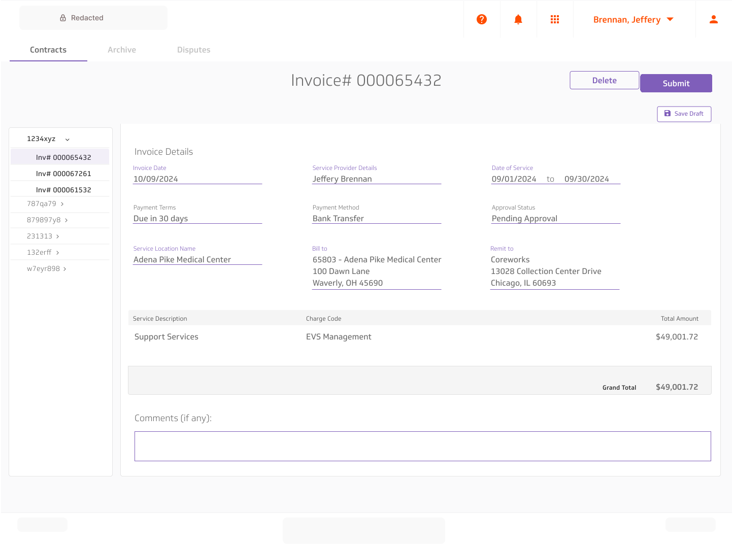
The page looks and feels like a real invoice, with related information grouped together.

Clear actions, simpler inputs, and straightforward navigation make the page easier to use.

Unnecessary tabs, side navigation, and visual clutter were removed to keep the focus on the invoice.

Invoice Formatting Iterative Design

Our first pass cleaned up the interface, but feedback showed we hadn't solved the bigger problem—it still didn't feel like a real invoice. Because many users weren't technical, we continued refining the layout through multiple rounds of VOC feedback until it felt familiar and easy to read.

Built-In Disputes

The original product had no way to dispute an invoice. I introduced a dedicated dispute flow that let suppliers, reviewers, and procurement resolve issues without leaving the product.

Invoice Submission

Submitting an invoice no longer required downloading and reuploading an Excel file. Instead, users completed a dedicated invoice screen that looked and felt like a real invoice while matching the experience across the rest of the product.

Invoice Submission OCR

aded emai invoice /scanning ai etc bla blah

Contract Details/Creation

The same screen was used for both creating and viewing finished contracts. Displaying multiple disabled fields in the edited state made it difficult to understand.

Users had to download and reupload an Excel file to attach an invoice.

Submitting an invoice required downloading and reuploading an Excel file, adding unnecessary steps.

Contract creation and contract details were split into separate screens, making each task easier to focus on.

The Excel upload was replaced with a dedicated invoice submission experience that felt like filling out a real invoice. (Previously Shown)

Additional contract details were brought onto the page, giving users the information they needed without extra navigation.

The New Contract Details & Creation

The original page combined contract creation and contract management into one screen, making both harder to use. Splitting them into dedicated experiences gave each screen a clear purpose.

The new contract details page reused the same layout as the invoice details page. This created a familiar experience for users while keeping the product consistent.

Refining the Contract Creation Flow

The first version worked, but usability testing revealed that users weren't always sure what had been completed or what came next. I added a progress tracker and subtle completion indicators to provide better guidance throughout the flow.

Dashboard

Confusing navigation, no context/instruction and weak page hierarchy made it hard to know where to go next.

The layout felt outdated and didn't support the different needs of each user role.

Limited search and unclear contract status made finding and managing contracts more difficult.

Created role-specific dashboards so each user saw the information and actions most relevant to their work.

Added key metrics to give users a quick view of workload and to encourage insight into action.

Introduced a work queue to surface the highest priority tasks and help users stay on top of their work.

Designed for Every Role

Rather than creating three completely different dashboards, I reused the same foundation across each role. Tabs, metrics, and content were then tailored to match what each user needed to see.

Feedback & Reception

After reaching feature parity, we validated the redesign through VOC sessions and then presented the updated flows to Mayo leadership for feedback and alignment.

Mayo Clinic was very happy with the redesign progress so we continued redesigning the rest of the application, adding multiple new features while running VOC sessions every two weeks to ensure users were satisfied and the design stayed on track.

Blake - thank you for jumping in with such enthusiasm and making an immediate impact since joining the team. Your dedication to enhancing the UI and UX has not gone unnoticed. I truly appreciate your thoughtfulness and hard work you bring to improving our users’s experience, and I value your partnership every step of the way.

Waseem H.

Senior Director of Product Delivery

Thank you for being a UX design weapon on the Service Sync project. I want to recognize you for: Raising the bar on Service Sync design, providing high quality design iterations in a timely manner, being a true advocate of the customer by leading VoC sessions and incorporating their feedback into our solutions, leading client facing UX presentations, collaborating with the engineering team to address design feedback, and being a great design partner. Looking forward to our continued collaboration.

Matt C.

AVP Finance Delivery

The Final Product

Continuing with the redesign we also added new features like the ability to add suppliers, notifications, user profiles and many more.

What Changed and Why it Mattered

VendorBridge went from a confusing, outdated liability to a tool users trust and Mayo Clinic depends on, thanks to a complete redesign and renewed relationships across teams.

Streamlined Core Workflows

Simplified the product with clearer navigation and a more structured interface, making key tasks faster and easier to complete.

Rebuilt Stakeholder Confidence

Worked closely with stakeholders to align on a better direction and regain support for the redesign.

Repaired a Strained Client Partnership

Delivered clearer, higher-quality work and collaborated closely with the client to rebuild trust and move forward.

Let's Talk

Let's Talk

Currently looking for new roles & ready to start within a 2 weeks notice.

Copyright © Blake Schubert 2025

Built With Framer, Figma, Cursor & v0

Linkedin